
ByMatiss
( 2026 )
Visual Identity
Systems design
ByMatiss
( 2026 )
Visual Identity
Logo Design
ByMatiss
( 2026 )
Visual Identity
Logo Design
Matiss is a filmmaker and colourist based in Dubai, working worldwide. He focuses on storytelling, documentary, action and commercial work for brands and agencies, as well as smaller businesses.
His work had outgrown his identity, so the refresh needed a clearer "M" icon and one consistent way to present information. We drew on microsystems and his existing brand elements and found a middle ground between the two.
Matiss is a filmmaker and colourist based in Dubai, working worldwide. He focuses on storytelling, documentary, action and commercial work for brands and agencies, as well as smaller businesses.
His work had outgrown his identity, so the refresh needed a clearer "M" icon and one consistent way to present information. We drew on microsystems and his existing brand elements and found a middle ground between the two.
Matiss is a filmmaker and colourist based in Dubai, working worldwide. He focuses on storytelling, documentary, action and commercial work for brands and agencies, as well as smaller businesses.
His work had outgrown his identity, so the refresh needed a clearer "M" icon and one consistent way to present information. We drew on microsystems and his existing brand elements and found a middle ground between the two.
Microsystems are small, systematic interfaces that show information: labels, readouts and displays. This suits a filmmaker, because his work is already surrounded by camera menus, timecodes and metadata. It also gives the brand a technical, precise character that supports his work as a colourist, where small adjustments matter.
The mark is built from stacked horizontal lines in a stepped form. The lines carry the idea of a scanline, a frame and a screen, so the letter reads as an "M" and also as a piece of film or display technology. Because it is built from simple bars, it works in black on colour and in white on black.
Microsystems are small, systematic interfaces that show information: labels, readouts and displays. This suits a filmmaker, because his work is already surrounded by camera menus, timecodes and metadata. It also gives the brand a technical, precise character that supports his work as a colourist, where small adjustments matter.
The mark is built from stacked horizontal lines in a stepped form. The lines carry the idea of a scanline, a frame and a screen, so the letter reads as an "M" and also as a piece of film or display technology. Because it is built from simple bars, it works in black on colour and in white on black.

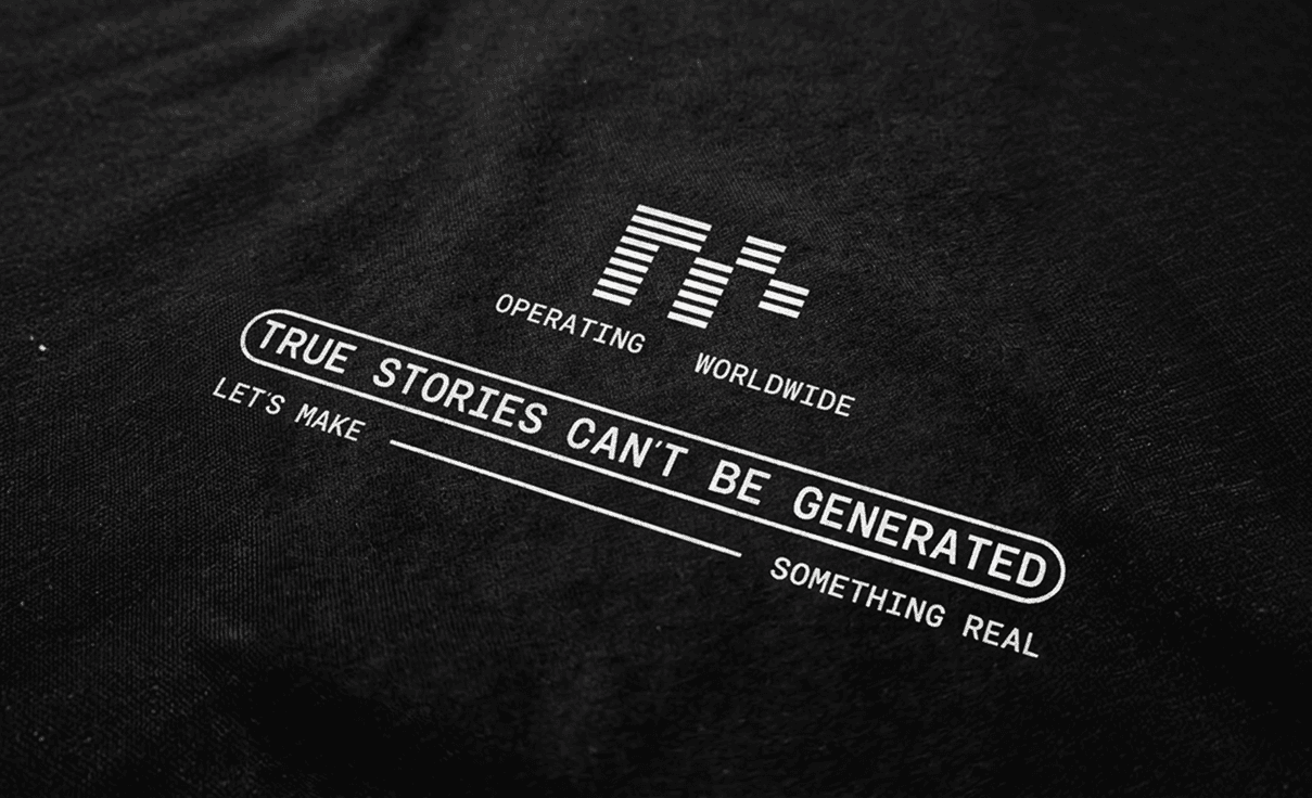
Matiss now owns a brand system, not just a logo. The "M" icon, label structure, pills, rules, type and colour work together, so any new use can be built from the same parts without redesigning the identity. The system carries his voice and his work: microsystems for the technical side of filmmaking, a palette from his own footage, and a tone that states what he stands for.
Matiss now owns a brand system, not just a logo. The "M" icon, label structure, pills, rules, type and colour work together, so any new use can be built from the same parts without redesigning the identity. The system carries his voice and his work: microsystems for the technical side of filmmaking, a palette from his own footage, and a tone that states what he stands for.
